


9 Powerful CSS Container Queries Patterns That Beat Media Queries
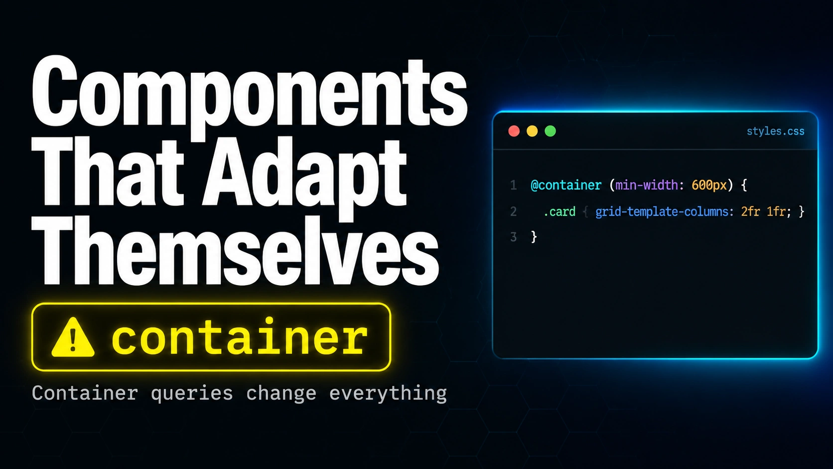
Table of Contents
For twenty years CSS could only ask one question about layout: how big is the window. CSS container queries finally let a component ask how big its parent is, which is a much more useful question if you build reusable design-system pieces. A card living in a 320-pixel sidebar wants to stack. The same card living in a 900-pixel hero wants to spread out. Media queries cannot tell the two apart because they only see the viewport. CSS container queries can.
This post walks through nine powerful CSS container queries patterns: the five-minute setup, your first @container rule, the new container query units, the adaptive card that drops into any slot, named containers for nested layouts, the gotchas that bite even experienced developers, the browser support and fallback strategy, when not to reach for the feature, and a quick-start checklist you can keep open while you migrate. Each pattern is a runnable snippet you can paste into a CodePen and watch behave.
Why Media Queries Cannot See Your Components
Imagine a card component that shows a title, a small description, and a button. The same card needs to live inside a 280-pixel sidebar on one page and inside a 700-pixel feature slot on another. With media queries, the only signal available is the screen width. The card has no way to ask how much room it actually has right now.
Developers worked around this for two decades with three painful patterns: writing variant classes (card-narrow, card-wide), passing slot-aware props through every component library, or using JavaScript resize observers. All three move logic out of CSS, which is where layout decisions actually belong. CSS container queries fix the gap by letting an element react to its parent size, not the viewport size.
Here is the difference in one snippet:
/* Media query: viewport-aware, component-blind */
@media (min-width: 700px) {
  .card { display: flex; }
}

/* Container query: component-aware */
@container (min-width: 400px) {
  .card { display: flex; }
}
The media query fires when the entire viewport is at least 700 pixels wide. The container query fires when whichever element is marked as a container is at least 400 pixels wide, regardless of how big the window is. Drop the same card into a wide hero and the rule kicks in. Drop it into a narrow sidebar and it does not. The CSS container queries syntax does for components what flexbox did for one-dimensional layout in 2015: it makes the hard thing a one-liner.
Pattern 1: The Five-Minute CSS Container Queries Setup
CSS container queries require two pieces. First, mark an ancestor as a query container using the container-type property. Second, write @container rules whose descendants react to that ancestor size. The container itself never changes; only its children do.
/* Step 1: declare the container */
.card-wrapper {
  container-type: inline-size;
}

/* Step 2: write rules that respond to the container size */
@container (min-width: 400px) {
  .card {
    display: flex;
    gap: 24px;
  }
}
The container-type value of inline-size means the browser tracks the wrapper inline (horizontal in left-to-right languages) dimension. There is also a size value that tracks both inline and block (vertical), but it forces the container to define its own size, which is rarely what you want. Stick with inline-size for ninety percent of CSS container queries work.
Pattern 2: Your First @container Rule
The @container at-rule looks like @media but operates on the nearest ancestor declared as a container. Multiple thresholds stack the same way:
.card-wrapper {
  container-type: inline-size;
}

.card { padding: 12px; }

@container (min-width: 320px) {
  .card { padding: 16px; }
}

@container (min-width: 600px) {
  .card {
    display: flex;
    align-items: center;
    padding: 24px;
  }
}

@container (min-width: 900px) {
  .card {
    grid-template-columns: 240px 1fr;
    display: grid;
  }
}
Notice that the rules cascade exactly like @media rules: the highest matching threshold wins. The card hits one of four states depending on how wide its parent is, and the CSS container queries engine swaps the right rule in for each frame the parent is resized. No JavaScript, no resize observer, no variant classes.
Pattern 3: CSS Container Queries Units (cqi, cqw, cqh)
Alongside the @container rule, CSS container queries shipped with new length units that scale relative to the container instead of the viewport. The two you will use every day are cqi (one percent of the container inline size) and cqw (one percent of the container width). For block (vertical) dimensions there are cqb and cqh.
.card-wrapper { container-type: inline-size; }

.card h2 {
  /* Headline scales smoothly with its parent. No breakpoints, no calc. */
  font-size: clamp(1.25rem, 4cqi + 0.5rem, 2.5rem);
}

.card .badge {
  /* Padding grows with the container too */
  padding-inline: clamp(0.5rem, 2cqi, 1.25rem);
}
The clamp wrapper is important. Container query units alone scale linearly forever, which means a heading inside a 2,000-pixel container would become absurdly large. Clamp gives you a sensible minimum and maximum and lets cqi do the in-between smoothly. The CSS container queries unit trick replaces an entire category of viewport-unit hacks that frontend developers have been writing since 2018.
Pattern 4: The Adaptive Card That Works in Any Slot
This is the pattern that sells CSS container queries to design-system maintainers. One card definition, dropped into a sidebar or hero, and it behaves correctly in both:
<!-- HTML -->
<section class="sidebar">
  <article class="card-wrapper">
    <div class="card">...</div>
  </article>
</section>

<section class="hero">
  <article class="card-wrapper">
    <div class="card">...</div>
  </article>
</section>

/* CSS */
.card-wrapper { container-type: inline-size; }

.card {
  display: grid;
  gap: 12px;
  padding: 16px;
}

@container (min-width: 480px) {
  .card {
    grid-template-columns: 120px 1fr;
    align-items: start;
  }
}
Inside the narrow sidebar the wrapper is 280 pixels wide, the @container rule does not fire, and the card stacks. Inside the hero the wrapper is 700 pixels wide, the rule fires, and the card splits into an image column and a content column. Same markup, same CSS, two layouts. That is why CSS container queries are sometimes called the missing piece of component-driven design.
Pattern 5: Named Containers for Nested Layouts
By default @container looks up to the nearest ancestor with container-type set. When you have nested containers (a card inside a section inside a layout grid), you need to specify which one a rule targets. Use container-name to give containers identifiers, then reference them in the @container rule:
.layout-grid { container-type: inline-size; container-name: layout; }
.card-wrapper { container-type: inline-size; container-name: card; }

/* Reacts to the card wrapper, not the outer grid */
@container card (min-width: 400px) {
  .card { display: flex; }
}

/* Reacts to the outer grid, even from deep inside */
@container layout (min-width: 1200px) {
  .card .meta { font-size: 0.875rem; }
}
The shorthand container: card / inline-size sets both at once. Named CSS container queries are also how you avoid the surprise where a rule designed for a card accidentally fires because some ancestor flexed past the threshold. Name your containers from day one. Future-you will thank you.
Pattern 6: The CSS Container Queries Gotchas Nobody Warns You About
Three things will trip you up if you have never shipped CSS container queries before. First: the container itself cannot reference its own size in rules. @container (min-width: 400px) { .card-wrapper { background: red; } } will not work, because the wrapper is the container, not a descendant. Apply the rule to a child instead.
Second: container-type creates containment, which means the element no longer participates in layout calculations from inside its children. For most components that is exactly what you want, but inside a fluid grid using subgrid or aspect-ratio it can produce surprising results. Test the layout you care about after adding container-type.
Third: container query units only resolve when the element is inside a container. font-size: 4cqi on an element outside any container falls back to its initial value, which can collapse text invisibly. The MDN reference for CSS container queries documents the exact resolution rules.
Pattern 7: Browser Support and the @supports Fallback
CSS container queries reached stable in Chrome 105, Safari 16, and Firefox 110, so every evergreen browser since late 2022 supports them. Real-world support according to caniuse data from 2026 is above ninety-five percent of global traffic. For the remaining slice, write your fallback first and progressively enhance:
/* Baseline: a sensible single-column layout */
.card {
  display: grid;
  gap: 12px;
  padding: 16px;
}

/* Enhanced: only browsers that understand container queries get this */
@supports (container-type: inline-size) {
  .card-wrapper { container-type: inline-size; }

  @container (min-width: 480px) {
    .card { grid-template-columns: 120px 1fr; }
  }
}
The @supports test guarantees the @container rule only runs where it is meaningful. Old browsers see the baseline; new ones get the enhanced CSS container queries layout. This is the same progressive-enhancement story as grid in 2017 and flexbox in 2015. By 2027 the @supports wrapper will be ceremony you can drop.
Pattern 8: When NOT to Reach for CSS Container Queries
CSS container queries are not a replacement for media queries. Three signals tell you to use a media query instead. First, if the rule is about the device class (touch vs hover, dark mode preference, reduced motion), that is a media-query feature and has nothing to do with size. Second, if the rule depends on the entire page layout (a navigation bar that becomes a hamburger below 768 pixels of viewport), the viewport is the right source of truth. Third, if you are deciding whether a feature shows at all (hide the print sidebar in print stylesheets), media queries are the cleaner tool.
The mental rule of thumb is: media queries answer what kind of device or page this is. CSS container queries answer how much room this component has. A robust design system uses both. The container query handles intrinsic component behaviour; the media query handles page-level layout shifts.
Pattern 9: The Quick-Start Checklist
If you are dropping CSS container queries into an existing codebase tomorrow, here is the migration order that minimises pain:
1. Pick one component (cards or modals are the easiest)
2. Add container-type: inline-size to the component wrapper
3. Add container-name: <component-name> on the same wrapper
4. Replace one variant class with an @container <name> rule
5. Wrap the new rule in @supports (container-type: inline-size)
6. Drop the variant class from the markup
7. Open every page that uses the component and verify visually
8. Repeat for the next component
Going one component at a time keeps the diff reviewable and the rollback path simple. Within a week you can have your entire card, modal, list-item, and table-cell components migrated to CSS container queries with no JavaScript, no variant classes, and no breakpoint juggling. Frameworks like Tailwind 4 and Bootstrap 6 ship dedicated container-query utilities; for hand-written CSS, the pattern above is everything you need.
Watch the Full Breakdown
The full eight-scene walk-through of CSS container queries (the live container resize, the inline-size declaration in context, every @container rule firing as the container grows, the gotchas around containment and named containers, and the browser support story) is in the companion video below. There is a one-minute version on YouTube Shorts as well.
For more deep dives into CSS, frontend engineering, and the operational details that keep production design systems sane, browse the rest of the Web Development section on this site.